
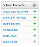
Form elements
Six elements are available to add to a form. To add an element click the element's name or the green plus sign or drag and drop the element onto the Element panel. See the full example form made up of the fields below.
Elements can be reordered in your form by dragging them to a new location.
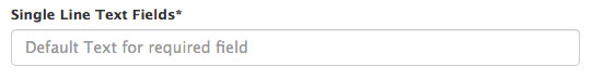
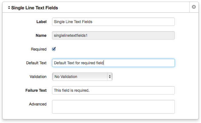
Single Line Text Fields
A single-line, text-field element provides users with one line on which to input data.
On the page:
How it appears when creating the form:
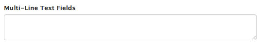
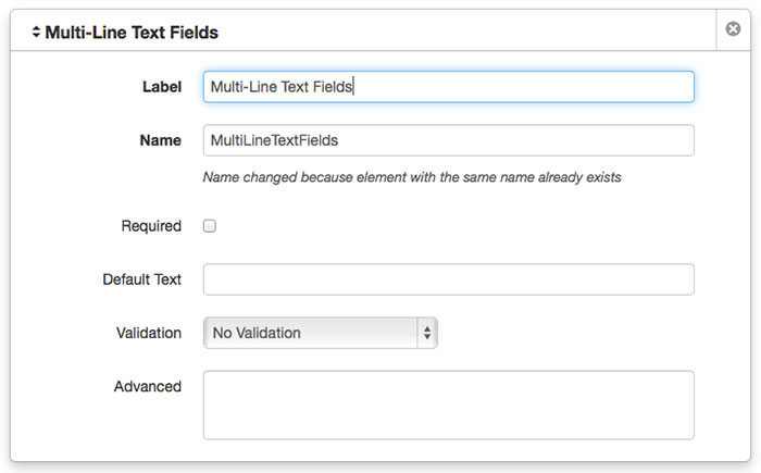
Multi-Line Text Field
A multi-line text field element provides users with a multi-line text field in which to input data. Similar to the single-line text field element except that the input field can take more input and can be configured to appear larger. This is done with the use of the cols and rows attributes in the Advanced field.
On the page:
How it appears when creating the form:
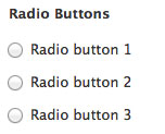
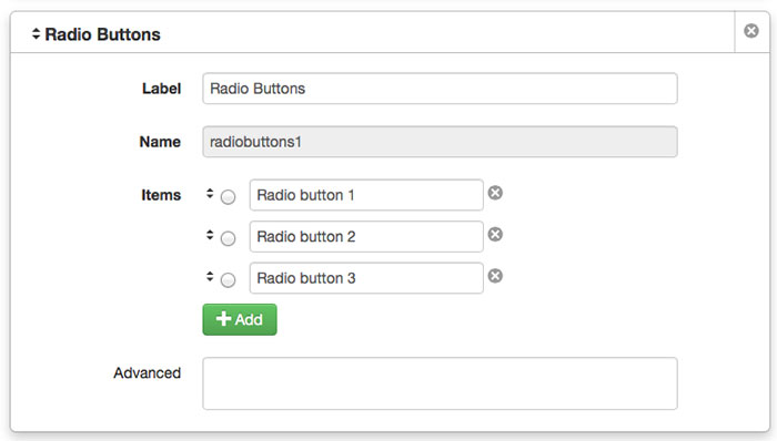
Radio Buttons
Radio button elements allow users to create a form element with multiple, predefined items of which one and only one can be selected by the user. Click the Add button next to Items in order to add a radio button with text.
On the page:
How it appears when creating the form:
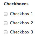
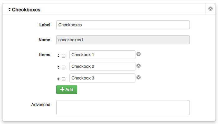
Checkboxes
The Checkboxes element can be used to create a form element with multiple, predefined items of which one, none, or more than one can be selected by the user. Click the Add button next to Items in order to add each checkbox and define the text. Preselecting one or more checkbox items when creating or editing the form, will preselect the items on the published page also.
On the page:
How it appears when creating the form:
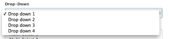
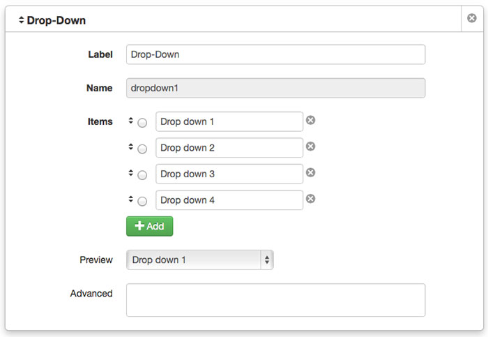
Drop-Down
Drop-down form elements provide users with the ability to select an item from a list of pre-defined options using a drop-down style menu. Click the Add button to add each item.
On the page:
How it appears when creating the form:
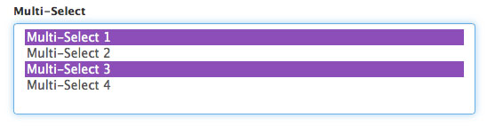
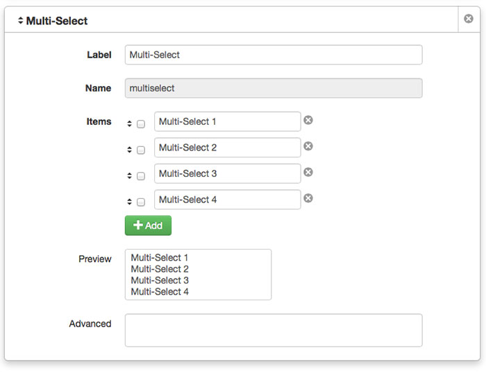
Multi-Select
The Multi-Select form element includes the ability to select multiple items using the keyboard shortcut: CTRL + click for PC or Command (⌘) + click for Mac.
On the page:
How it appears when creating the form:
Element attributes
There are six different form elements. All elements have a Label and a Name.
- Label is the name that will appear next to the form field on your form.
- Name is a unique identifier for each form field. Name is automatically created by entering text in the Label field. You can only edit Name when the element is first created.
Required and Required Failure Text
Available for single-line and multi-line elements.
Select the Required checkbox in order to compel the user to provide input for the element.
Additionally, when selecting Required, the Required Failure Text field becomes available. Use this field to define the text that provides an error message for the visitor, if the field has not been completed correctly prior to submission.
Default Text
Optional. Available for single-line and multi-line elements.
Entering a value into the Default Text is optional. If a message is entered it is shown as the initial value for the form element. The message should contain a helpful tip or example of the desired entry format.
Validation and Additional Validation Messages
Defines a validation method for the element; default is No Validation. Selecting a specific validation method also provides one or more additional fields for further refinement of the validation to be used and for providing the failure text. The failure text can be used in order to give the user a hint about what is required. The options for the Validation field are as follows:- No validation
- Email address
- Minimum length, for example for phone numbers or other entries that have a set number of characters. The additional Minimum Length Field is used to specify the number of characters.
- Regular Expression provides a way to match strings of text based on patterns or patterns of characters.
Email Messages Panel
When the form is submitted, the form submission results can be emailed to one or more recipients. Add an email message by clicking the Add button. Adding additional email messages can also allow for defining a different message to be sent to specific email addresses.
- To: Defines a recipient or recipients for the email to be sent to. More than one email recipient can be added by separating each with a semicolon (;). Note that a semi-colon must be used; a comma or space will break the form.
- From: Specify the email address that should appear as the sender.
- Subject: The subject line should be included in order to help the recipient classify the email.
- Body: To include the results of the form submission, the value of the Name field of an element can be passed. The syntax for this is to encapsulate the value in two sets of braces. For example if the Name of an element is defined as comments, then include {{comments}} in the Body of the email. These variables can also be included in the To, From, and Subject fields. After entering the opening braces, a pick-list becomes available with the value of the variables.
Form Settings Panel
Form Settings allows users to create custom system messages that display upon a failed or successful form submission to the database. The following elements are displayed in Form Settings:
- Success Message: The message that displays to users after they have successfully completed a form submission.
- Failure Message: The message that displays when there is an error with form submission. A list of issues that are preventing the page from being submitted is also included in the message.
- Save Results: By default, this option is selected. When this option is selected, all form submissions are saved to the form submission archives.
- Viewing Form Submissions
Viewing Form Submissions
When users complete a form, the results, or the form submissions, are sent to the database, and if so configured, emailed. Authors can view these results on the Form Submission screen.
To view the submissions, navigate to the Form Submissions screen with one of the following methods:
- From the Assets screen, hover over the asset and from the asset does not need to be checked out.

- From the assets action toolbar, click Form Submissions.

Exporting Form Submissions
To export the Form Submission results to a CSV file:
- Navigate to the Form Submission screen by selecting Content > Assets from the global navigation bar. Hover over the Asset and choose Form Submissions from the Review menu.
- Click the CSV button (The icon that looks like a page with a down arrow in it). The form results are provided in a CSV file format and downloaded to the local computer. This file can be loaded into spreadsheet software like Excel.