Adding disclosures
Disclosures can be helpful to make a page more concise without cutting content not needed by everyone. They are best used for FAQ type pages and should be used sparingly.
Note: The disclosure component was updated in June 2025. You no longer need to choose a content region for the components.
- Inserting it into a page provides separate editable regions that can contain text, images or other content.
- The Headline should be the content you want to appear regardless of whether the disclosure is open or closed. The heading must be descriptive enough for the user to decide which disclosure to open. If a user has to open a disclosure to determine if the hidden information is useful, the benefit is lost.
- The Heading level should follow the logical order of the page. See Accessibility guidelines for more information. (Users with access to the Canvas training course can review the headings section in the accessibility module.) You will select a single heading level for the entire component.
- Optionally, it can be set to be open or closed on page load.
- Each disclosure has an optional stylized link that will show below the disclosure content.
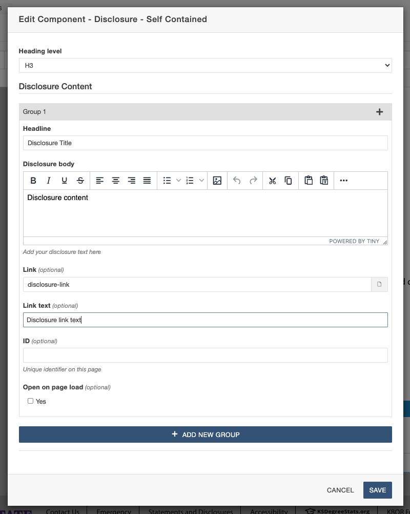
- To add more disclosures to the component, click Add New Group. Fill the content for the next disclosure(s) like the first in the same component.
- After inserting the disclosure and adding the content, save the component. It will display as a plain component in the editor.
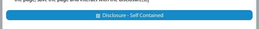
- To view the component on the page, save the page and interact with the disclosure(s).
Disclosures should not be used
- When all or most disclosures will eventually be opened. For example, steps in a sequential process are a poor use of disclosures.
- When the hidden information is small enough that significant screen space isn't saved.