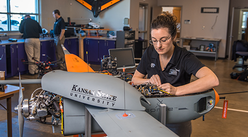
Highlight boxes - with images
Use the Highlight boxes - with images component to display a limited number of highlighted choices that offer alternatives pathways for exploring your content.
Either 2, 3, or 4 boxes may be used. At large window sizes, all boxes will display on a single row. For smaller windows, the boxes will shrink and then switch to display on multiple rows. For small displays such a phone in portrait mode, the boxes will stack vertically.
Each box must have an image. The images:
- Must have an aspect ratio of 16x9. Recommended pixel sizes are either 400x225 or 800x250.
- Must not have a field of purple at the top that would blend with the purple border at the top of the image area.
- Must fill the area without whitepace.
- Must not have text overlaid on the image.
All boxes must link to another page.
Each box may optionally have:
- A headline, the large purple text under the image. The headline must be short, e.g., 3-6 words.
- A single paragraph of text underneath the headline.
- A button that adds a call to action.
Typical Usage
The component is typically used with two or three boxes.
However, the component may be also be used:
- with 2, 3, or 4 boxes
- with and without headlines, text, and buttons
- with either a white or gray background
To view these alternatives, see the examples page.


